Due to the internationalization of the developed mobile application, there may be issues with incomplete display or style distortion for minority languages. In such cases, the problem needs to be addressed at the style level, such as displaying ellipsis when exceeding one line, which is easily solvable and highly compatible.
max-width: 3rem;
overflow: hidden;
text-overflow: ellipsis;
white-space: nowrap;
However, if you want to truncate multiple lines and display ellipsis after exceeding two lines of text, it becomes relatively more complicated. Some CSS properties can solve the problem of truncating multiple lines.
overflow: hidden;
text-overflow: ellipsis;
display: -webkit-box;
-webkit-line-clamp: 2;
-webkit-box-orient: vertical;
The above code works well in the Chrome browser and meets the actual requirements. However, when running in an app and opening the corresponding webview, it is found that it cannot fully meet the actual requirements and has many compatibility issues. Therefore, this solution cannot completely solve the requirement. This document provides many alternative solutions.
Complete Guide to Truncating Text with Ellipsis (...) in Multiple Lines - Front-end Web Development
In practical scenarios, using JavaScript can solve our requirements. However, I came across an article that explains how to use CSS to truncate text. The article discusses several methods, but I think the last method perfectly solves my requirement. Below is the method mentioned in the article:
Truncating Text in Multiple Lines Using the Float Property#
Going back to the initial content I wanted to work on, which is truncating multi-line title text, it is obviously impossible to control the length of the title, so the above method cannot be used. Looking back at the essence of the matter: we hope that CSS can have a property that can display ellipsis when the text overflows, and not display ellipsis when it does not overflow. (Two forms, two effects)
Just when I thought CSS was powerless and could only be implemented through JS, I later came across a very clever method that can meet all the criteria mentioned above. Below, I will introduce how to use the float property to achieve the effect of truncating multi-line text.
Basic principle:
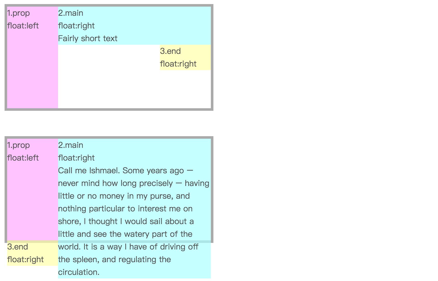
There are three div boxes, with the pink box floating left, the light blue box and the yellow box floating right.
- When the height of the light blue box is lower than the pink box, the yellow box will still be positioned below the light blue box.
- If the text in the light blue box is too long and exceeds the height of the pink box, the yellow box will not stay below the light blue box, but will drop below the pink box.
Okay, the two states and their corresponding display forms have been distinguished. We can position the yellow box relatively and move the overflowing yellow box to the bottom right corner of the text content, while the non-overflowing yellow box will be moved to outer space, as long as we use overflow: hidden to hide it.
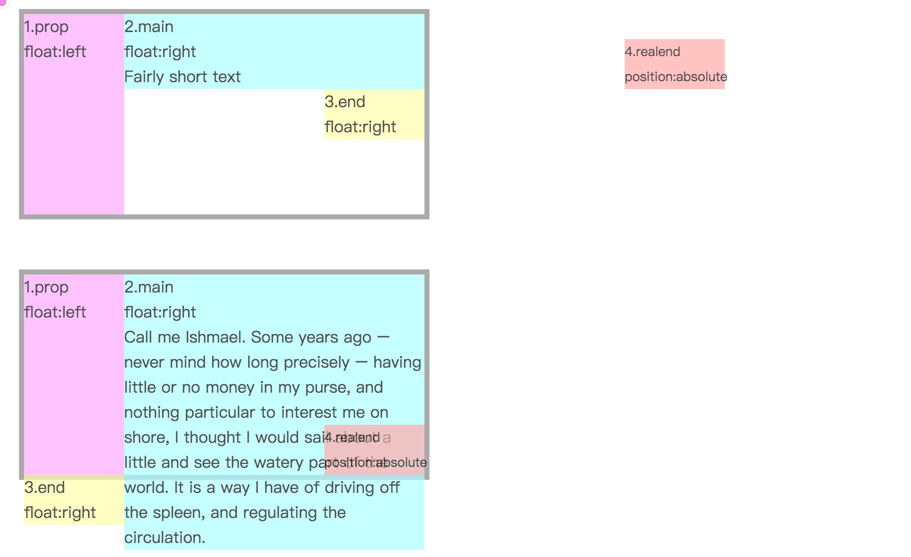
This is the basic principle. We can imagine the light blue area as the title and the yellow area as the ellipsis effect. You may think that the pink box occupies space, so won't the title be delayed as a whole? This can be solved by using a negative value for margin. Set the negative value of margin-left of the light blue box to be the same as the width of the pink box, and the title can be displayed normally.
So let's simplify the previous DOM structure to the following:
<div class="wrap">
  <div class="text">Lorem ipsum dolor sit amet, consectetur adipisicing elit. Dignissimos labore sit vel itaque delectus atque quos magnam assumenda quod architecto perspiciatis animi.</div>
</div>
The pink box and the yellow box from before can be replaced with pseudo-elements.
.wrap {
height: 40px;
line-height: 20px;
overflow: hidden;
}
.wrap .text {
float: right;
margin-left: -5px;
width: 100%;
word-break: break-all;
}
.wrap::before {
float: left;
width: 5px;
content: '';
height: 40px;
}
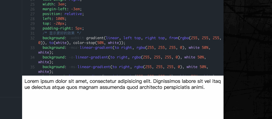
.wrap::after {
float: right;
content: "...";
height: 20px;
line-height: 20px;
/* width of three ellipsis */
width: 3em;
/* make the box not take up space */
margin-left: -3em;
/* move the ellipsis */
position: relative;
left: 100%;
top: -20px;
padding-right: 5px;
}
Implementation result: demo link
This is the most clever method I have seen so far. It only requires support for CSS 2.1 features. Its advantages are:
- Good compatibility, with good support for major browsers
- Responsive truncation, adjusting according to different widths
- Only display ellipsis when the text exceeds the range, otherwise do not display ellipsis
As for the disadvantages, because we are simulating ellipsis, sometimes the display position cannot be just right. Therefore, you can consider:
- Adding a gradient effect to fit the text, just like the demo effect mentioned above
- Adding
word-break: break-all;to allow a word to be split when wrapping, resulting in a better fit between the text and the ellipsis.
However, in actual use, I found that top: -20px in .wrap::after is offsetting upwards relative to wrap, which is inconsistent with the example in the article where it is offset downwards. In the end, I solved this problem by adding box-sizing: content-box; to wrap. It is probably because the layouts in my own project have affected it, and I am not sure why it happened for now.